Documentation
Learn how to use the tracking tool
Overview
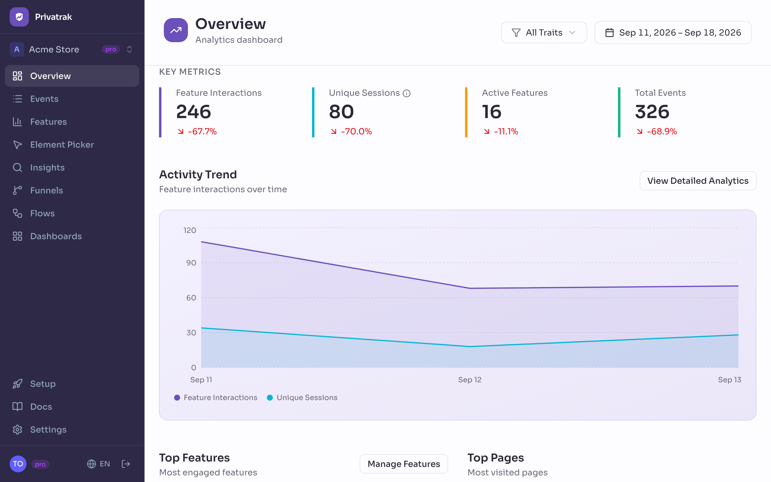
The Overview is where you land when you open the product, and it is built to be read in under a minute: how much is happening, whether that is more or less than before, which pages and features people are using, and whether your funnels are converting. Everything on it follows the date range in the page header.
What you can use it for
- Notice a change before someone else does: each of the four numbers at the top carries its change against the period immediately before it, so a bad week is visible without going looking for it.
- See what your product actually is to your customers: Top Pages and Top Features are the short answer, and it is often not the answer you would have given.
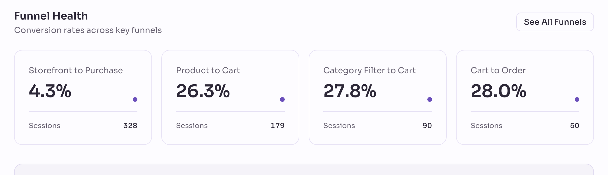
- Catch a funnel going wrong: the cards at the bottom show the conversion rate of your busiest funnels without opening any of them.
The four numbers at the top
Each of them shows its change against the period immediately before the one you are looking at, of the same length: a 7-day range is compared with the 7 days before it.
- Feature interactions: how many recorded actions matched one of the features you have named. If you have not named any yet, this sits at zero while the other three move.
- Unique sessions: how many visitors were counted. A visitor is counted once per day, so over a week the same person can be counted up to seven times. That is the deliberate price of not following anyone from one day to the next.
- Active features: how many of your named features were used at least once. Read next to the number of features you have defined, it tells you which of them nobody is touching.
- Total events: everything recorded — page views, clicks, submitted forms and your own custom events together. This is the number your plan’s monthly allowance is measured against.
An arrow pointing down is not automatically bad news. A range that ends mid-week, or one that includes a public holiday, moves all four numbers at once.

The activity chart
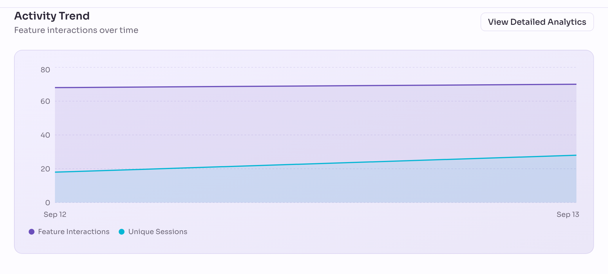
Feature interactions and visitors, day by day across the range. This is where a trend shows up that a single total hides: the same number of events can be a rising line one week and a falling one the next. View detailed analytics takes the same data to Insights, where you can filter it and break it down.
Top Features and Top Pages
- Top Features ranks the things you have named by how often they were used. It stays empty until you name something; Manage features opens the page where you do that.
- Top Pages ranks pages by views. A page is its site and its path together, so
/searchis one row however people searched. When two of your sites both serve the same path, the row shows the site in front of it so you can tell them apart.
Funnel health
Your four busiest funnels, each with its conversion rate and how many visitors entered it in the chosen range. Click a card to open the funnel itself. If you have not built one yet, the panel says so instead of drawing an empty chart.
The date range and the trait filter
Both sit in the page header and apply to everything below them. The date range also decides what the changes are measured against: the same number of days immediately before it.
The trait filter narrows the whole page to visitors carrying one trait, such as plan:pro. That is how you read the overview for one group of customers rather than for everybody. Traits only exist if your tracker sends them — see Sessions.
Before any data arrives
Until the first event reaches us, the page offers to help you install the tracker instead of drawing empty charts. The numbers stay at zero and the chart is replaced by a line saying there is nothing yet. That is the honest answer, not a fault.
Where each panel leads
Every section is a way into the page that goes deeper: Events for the individual records behind the counts. Insights to ask a question of your own. Feature Tracking to name the things that matter to you, and Funnels for step-by-step conversion.